![]()
![]()
Brings Seurat to the tidyverse!
website: stemangiola.github.io/tidyseurat/
Please also have a look at
tidyseurat provides a bridge between the Seurat single-cell package [@butler2018integrating; @stuart2019comprehensive] and the tidyverse [@wickham2019welcome]. It creates an invisible layer that enables viewing the Seurat object as a tidyverse tibble, and provides Seurat-compatible dplyr, tidyr, ggplot and plotly functions.
| Seurat-compatible Functions | Description |
|---|---|
all |
| tidyverse Packages | Description |
|---|---|
dplyr |
All dplyr APIs like for any tibble |
tidyr |
All tidyr APIs like for any tibble |
ggplot2 |
ggplot like for any tibble |
plotly |
plot_ly like for any tibble |
| Utilities | Description |
|---|---|
tidy |
Add tidyseurat invisible layer over a Seurat
object |
as_tibble |
Convert cell-wise information to a tbl_df |
join_features |
Add feature-wise information, returns a tbl_df |
aggregate_cells |
Aggregate cell gene-transcription abundance as pseudobulk tissue |
From CRAN
install.packages("tidyseurat")From Github (development)
devtools::install_github("stemangiola/tidyseurat")library(dplyr)
library(tidyr)
library(purrr)
library(magrittr)
library(ggplot2)
library(Seurat)
library(tidyseurat)tidyseurat, the best of both worlds!This is a seurat object but it is evaluated as tibble. So it is fully compatible both with Seurat and tidyverse APIs.
pbmc_small = SeuratObject::pbmc_smallIt looks like a tibble
pbmc_small## # A Seurat-tibble abstraction: 80 × 15
## # [90mFeatures=230 | Cells=80 | Active assay=RNA | Assays=RNA[0m
## .cell orig.ident nCount_RNA nFeature_RNA RNA_snn_res.0.8 letter.idents groups
## <chr> <fct> <dbl> <int> <fct> <fct> <chr>
## 1 ATGC… SeuratPro… 70 47 0 A g2
## 2 CATG… SeuratPro… 85 52 0 A g1
## 3 GAAC… SeuratPro… 87 50 1 B g2
## 4 TGAC… SeuratPro… 127 56 0 A g2
## 5 AGTC… SeuratPro… 173 53 0 A g2
## 6 TCTG… SeuratPro… 70 48 0 A g1
## 7 TGGT… SeuratPro… 64 36 0 A g1
## 8 GCAG… SeuratPro… 72 45 0 A g1
## 9 GATA… SeuratPro… 52 36 0 A g1
## 10 AATG… SeuratPro… 100 41 0 A g1
## # ℹ 70 more rows
## # ℹ 8 more variables: RNA_snn_res.1 <fct>, PC_1 <dbl>, PC_2 <dbl>, PC_3 <dbl>,
## # PC_4 <dbl>, PC_5 <dbl>, tSNE_1 <dbl>, tSNE_2 <dbl>But it is a Seurat object after all
pbmc_small@assays## $RNA
## Assay data with 230 features for 80 cells
## Top 10 variable features:
## PPBP, IGLL5, VDAC3, CD1C, AKR1C3, PF4, MYL9, GNLY, TREML1, CA2Set colours and theme for plots.
# Use colourblind-friendly colours
friendly_cols <- c("#88CCEE", "#CC6677", "#DDCC77", "#117733", "#332288", "#AA4499", "#44AA99", "#999933", "#882255", "#661100", "#6699CC")

# Set theme
my_theme <-
  list(
    scale_fill_manual(values = friendly_cols),
    scale_color_manual(values = friendly_cols),
    theme_bw() +
      theme(
        panel.border = element_blank(),
        axis.line = element_line(),
        panel.grid.major = element_line(size = 0.2),
        panel.grid.minor = element_line(size = 0.1),
        text = element_text(size = 12),
        legend.position = "bottom",
        aspect.ratio = 1,
        strip.background = element_blank(),
        axis.title.x = element_text(margin = margin(t = 10, r = 10, b = 10, l = 10)),
        axis.title.y = element_text(margin = margin(t = 10, r = 10, b = 10, l = 10))
      )
  )
We can treat pbmc_small effectively as a normal tibble
for plotting.
Here we plot number of features per cell.
pbmc_small %>%
  ggplot(aes(nFeature_RNA, fill = groups)) +
  geom_histogram() +
  my_theme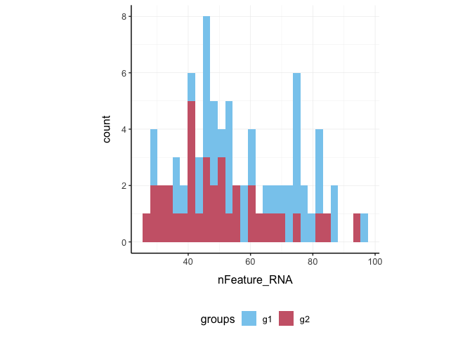
Here we plot total features per cell.
pbmc_small %>%
  ggplot(aes(groups, nCount_RNA, fill = groups)) +
  geom_boxplot(outlier.shape = NA) +
  geom_jitter(width = 0.1) +
  my_theme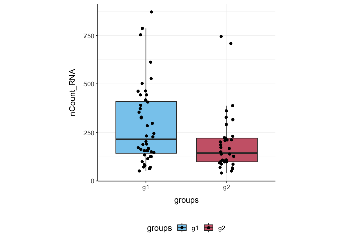
Here we plot abundance of two features for each group.
pbmc_small %>%
  join_features(features = c("HLA-DRA", "LYZ")) %>%
  ggplot(aes(groups, .abundance_RNA + 1, fill = groups)) +
  geom_boxplot(outlier.shape = NA) +
  geom_jitter(aes(size = nCount_RNA), alpha = 0.5, width = 0.2) +
  scale_y_log10() +
  my_theme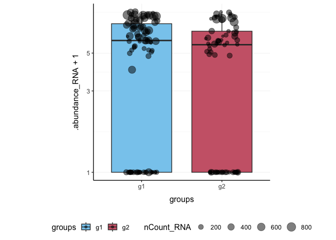
Also you can treat the object as Seurat object and proceed with data processing.
pbmc_small_pca <-
  pbmc_small %>%
  SCTransform(verbose = FALSE) %>%
  FindVariableFeatures(verbose = FALSE) %>%
  RunPCA(verbose = FALSE)

pbmc_small_pca
## # A Seurat-tibble abstraction: 80 × 17
## # [90mFeatures=220 | Cells=80 | Active assay=SCT | Assays=RNA, SCT[0m
## .cell orig.ident nCount_RNA nFeature_RNA RNA_snn_res.0.8 letter.idents groups
## <chr> <fct> <dbl> <int> <fct> <fct> <chr>
## 1 ATGC… SeuratPro… 70 47 0 A g2
## 2 CATG… SeuratPro… 85 52 0 A g1
## 3 GAAC… SeuratPro… 87 50 1 B g2
## 4 TGAC… SeuratPro… 127 56 0 A g2
## 5 AGTC… SeuratPro… 173 53 0 A g2
## 6 TCTG… SeuratPro… 70 48 0 A g1
## 7 TGGT… SeuratPro… 64 36 0 A g1
## 8 GCAG… SeuratPro… 72 45 0 A g1
## 9 GATA… SeuratPro… 52 36 0 A g1
## 10 AATG… SeuratPro… 100 41 0 A g1
## # ℹ 70 more rows
## # ℹ 10 more variables: RNA_snn_res.1 <fct>, nCount_SCT <dbl>,
## # nFeature_SCT <int>, PC_1 <dbl>, PC_2 <dbl>, PC_3 <dbl>, PC_4 <dbl>,
## # PC_5 <dbl>, tSNE_1 <dbl>, tSNE_2 <dbl>If a tool is not included in the tidyseurat collection, we can use
as_tibble to permanently convert tidyseurat
into tibble.
pbmc_small_pca %>%
  as_tibble() %>%
  select(contains("PC"), everything()) %>%
  GGally::ggpairs(columns = 1:5, ggplot2::aes(colour = groups)) +
  my_theme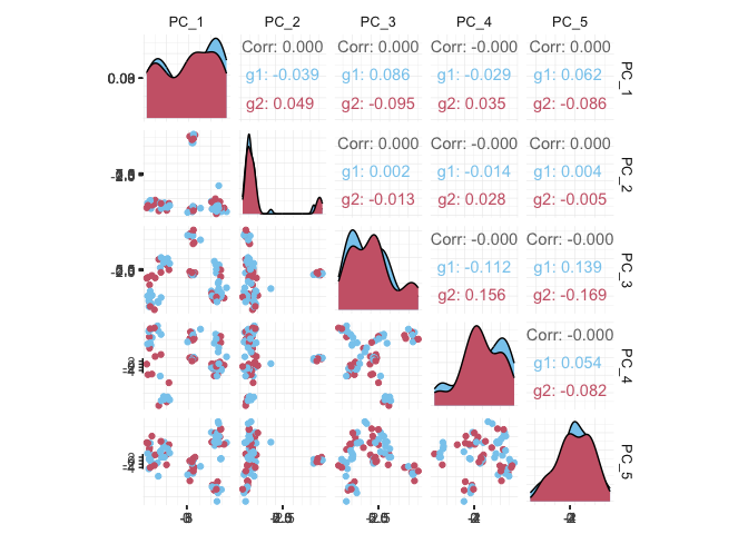
We proceed with cluster identification with Seurat.
pbmc_small_cluster <-
  pbmc_small_pca %>%
  FindNeighbors(verbose = FALSE) %>%
  FindClusters(method = "igraph", verbose = FALSE)

pbmc_small_cluster
## # A Seurat-tibble abstraction: 80 × 19
## # [90mFeatures=220 | Cells=80 | Active assay=SCT | Assays=RNA, SCT[0m
## .cell orig.ident nCount_RNA nFeature_RNA RNA_snn_res.0.8 letter.idents groups
## <chr> <fct> <dbl> <int> <fct> <fct> <chr>
## 1 ATGC… SeuratPro… 70 47 0 A g2
## 2 CATG… SeuratPro… 85 52 0 A g1
## 3 GAAC… SeuratPro… 87 50 1 B g2
## 4 TGAC… SeuratPro… 127 56 0 A g2
## 5 AGTC… SeuratPro… 173 53 0 A g2
## 6 TCTG… SeuratPro… 70 48 0 A g1
## 7 TGGT… SeuratPro… 64 36 0 A g1
## 8 GCAG… SeuratPro… 72 45 0 A g1
## 9 GATA… SeuratPro… 52 36 0 A g1
## 10 AATG… SeuratPro… 100 41 0 A g1
## # ℹ 70 more rows
## # ℹ 12 more variables: RNA_snn_res.1 <fct>, nCount_SCT <dbl>,
## # nFeature_SCT <int>, SCT_snn_res.0.8 <fct>, seurat_clusters <fct>,
## # PC_1 <dbl>, PC_2 <dbl>, PC_3 <dbl>, PC_4 <dbl>, PC_5 <dbl>, tSNE_1 <dbl>,
## # tSNE_2 <dbl>Now we can interrogate the object as if it was a regular tibble data frame.
pbmc_small_cluster %>%
  count(groups, seurat_clusters)
## # A tibble: 6 × 3
## groups seurat_clusters n
## <chr> <fct> <int>
## 1 g1 0 23
## 2 g1 1 17
## 3 g1 2 4
## 4 g2 0 17
## 5 g2 1 13
## 6 g2 2 6We can identify cluster markers using Seurat.
# Identify top 10 markers per cluster
markers <-
  pbmc_small_cluster %>%
  FindAllMarkers(only.pos = TRUE, min.pct = 0.25, thresh.use = 0.25) %>%
  group_by(cluster) %>%
  top_n(10, avg_log2FC)

# Plot heatmap
pbmc_small_cluster %>%
  DoHeatmap(
    features = markers$gene,
    group.colors = friendly_cols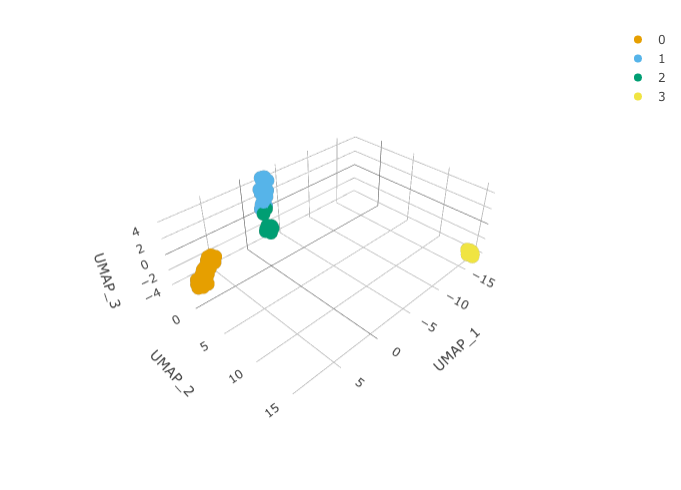
)We can calculate the first 3 UMAP dimensions using the Seurat framework.
pbmc_small_UMAP <-
  pbmc_small_cluster %>%
  RunUMAP(reduction = "pca", dims = 1:15, n.components = 3L)
And we can plot them using 3D plot using plotly.
pbmc_small_UMAP %>%
  plot_ly(
    x = ~`UMAP_1`,
    y = ~`UMAP_2`,
    z = ~`UMAP_3`,
    color = ~seurat_clusters,
    colors = friendly_cols[1:4]
  )
We can infer cell type identities using SingleR [@aran2019reference] and manipulate the output using tidyverse.
# Get cell type reference data
blueprint <- celldex::BlueprintEncodeData()

# Infer cell identities
cell_type_df <-
  GetAssayData(pbmc_small_UMAP, slot = 'counts', assay = "SCT") %>%
  log1p() %>%
  Matrix::Matrix(sparse = TRUE) %>%
  SingleR::SingleR(
    ref = blueprint,
    labels = blueprint$label.main,
    method = "single"
  ) %>%
  as.data.frame() %>%
  as_tibble(rownames = "cell") %>%
  select(cell, first.labels)
# Join UMAP and cell type info
pbmc_small_cell_type <-
pbmc_small_UMAP %>%
left_join(cell_type_df, by = "cell")
# Reorder columns
pbmc_small_cell_type %>%
select(cell, first.labels, everything())We can easily summarise the results. For example, we can see how cell type classification overlaps with cluster classification.
pbmc_small_cell_type %>%
  count(seurat_clusters, first.labels)
We can easily reshape the data for building information-rich faceted plots.
pbmc_small_cell_type %>%

  # Reshape and add classifier column
  pivot_longer(
    cols = c(seurat_clusters, first.labels),
    names_to = "classifier", values_to = "label"
  ) %>%

  # UMAP plots for cell type and cluster
  ggplot(aes(UMAP_1, UMAP_2, color = label)) +
  geom_point() +
  facet_wrap(~classifier) +
  my_theme
We can easily plot gene correlation per cell category, adding multi-layer annotations.
pbmc_small_cell_type %>%

  # Add some mitochondrial abundance values
  mutate(mitochondrial = rnorm(n())) %>%

  # Plot correlation
  join_features(features = c("CST3", "LYZ"), shape = "wide") %>%
  ggplot(aes(CST3 + 1, LYZ + 1, color = groups, size = mitochondrial)) +
  geom_point() +
  facet_wrap(~first.labels, scales = "free") +
  scale_x_log10() +
  scale_y_log10() +
my_themeA powerful tool we can use with tidyseurat is nest. We
can easily perform independent analyses on subsets of the dataset. First
we classify cell types in lymphoid and myeloid; then, nest based on the
new classification
pbmc_small_nested <-
  pbmc_small_cell_type %>%
  filter(first.labels != "Erythrocytes") %>%
  mutate(cell_class = if_else(`first.labels` %in% c("Macrophages", "Monocytes"), "myeloid", "lymphoid")) %>%
  nest(data = -cell_class)

pbmc_small_nested
Now we can independently for the lymphoid and myeloid subsets (i) find variable features, (ii) reduce dimensions, and (iii) cluster using both tidyverse and Seurat seamlessly.
pbmc_small_nested_reanalysed <-
  pbmc_small_nested %>%
  mutate(data = map(
    data, ~ .x %>%
      FindVariableFeatures(verbose = FALSE) %>%
      RunPCA(npcs = 10, verbose = FALSE) %>%
      FindNeighbors(verbose = FALSE) %>%
      FindClusters(method = "igraph", verbose = FALSE) %>%
      RunUMAP(reduction = "pca", dims = 1:10, n.components = 3L, verbose = FALSE)
  ))

pbmc_small_nested_reanalysed
Now we can unnest and plot the new classification.
pbmc_small_nested_reanalysed %>%

  # Convert to tibble otherwise Seurat drops reduced dimensions when unifying data sets.
  mutate(data = map(data, ~ .x %>% as_tibble())) %>%
  unnest(data) %>%

  # Define unique clusters
  unite("cluster", c(cell_class, seurat_clusters), remove = FALSE) %>%

  # Plotting
  ggplot(aes(UMAP_1, UMAP_2, color = cluster)) +
  geom_point() +
  facet_wrap(~cell_class) +
my_themeSometimes, it is necessary to aggregate the gene-transcript abundance from a group of cells into a single value. For example, when comparing groups of cells across different samples with fixed-effect models.
In tidyseurat, cell aggregation can be achieved using the
aggregate_cells function.
pbmc_small %>%
  aggregate_cells(groups, assays = "RNA")